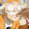
Avrae+ Posted February 21, 2011 Posted February 21, 2011 Ok, so this my first gaming photoshop pic.. lol that medic is me from server, tell me what do you think Quote
General Posted February 21, 2011 Posted February 21, 2011 Very Very nicee but...in my opinion, the medic in the middle makes it look worse Also, i'd advice making your name a diff color, or the letters more bold so its easier to see Quote
Zuthus Posted February 21, 2011 Posted February 21, 2011 It looks nice. Yes, you should take out the medic from there But overall its nice! Well here's mine Quote
Avrae+ Posted February 21, 2011 Author Posted February 21, 2011 Very Very nicee but...in my opinion, the medic in the middle makes it look worse Thx, u are right now that i look again it would be better without it, that medic was starting point of pic and ended up not to fit there lol. Luckily i still got the file so i can edit it if necessary. Also, i'd advice making your name a diff color, or the letters more bold so its easier to see I was thinking same but ended up this cos it was more neutral with other colours which i liked most. Quote
FunkybananA Posted February 24, 2011 Posted February 24, 2011 I like the flame effect, but as many here has already said, just take the medic off, it looks kinda retarded Though it's funny, but still Also change the text somehow, it blends in the background, which means it's hard to see.. Anyway in overall it looks good. Quote

Recommended Posts
Join the conversation
You can post now and register later. If you have an account, sign in now to post with your account.