Jump to content

ProjectCzarduSO 500%


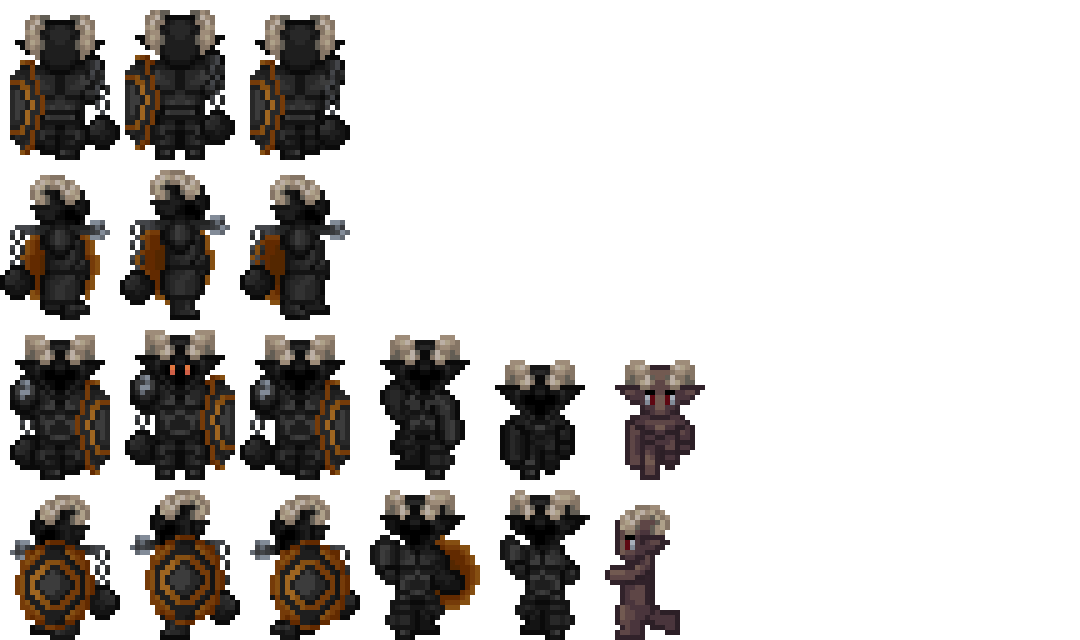
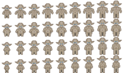
Followup of the Proportion Chart, here's what a "skin" could begin to look like in the game... Except... This one is too tall. There is a "default" offset to respect, so basically, every bloody image you see here : Are TWO BLOODY PIXELS too far down. Which could not be problematic, if he hasn't got those horns that would not fit otherwise !!! So this one is an abandonned project. And yet again : Magnified 5 times !

From the album:

Pixel Art from Zanda !

· 6 images
  • 6 images
  • 0 comments
  • 1 image comment


Recommended Comments

There are no comments to display.

Join the conversation

You can post now and register later. If you have an account, sign in now to post with your account.

Unfortunately, your content contains terms that we do not allow. Please edit your content to remove the highlighted words below.
Add a comment...

×   Pasted as rich text.   Paste as plain text instead

  Only 75 emoji are allowed.

×   Your link has been automatically embedded.   Display as a link instead

×   Your previous content has been restored.   Clear editor

×   You cannot paste images directly. Upload or insert images from URL.

×
×
  • Create New...

Important Information

By using this site, you agree to our Terms of Use.